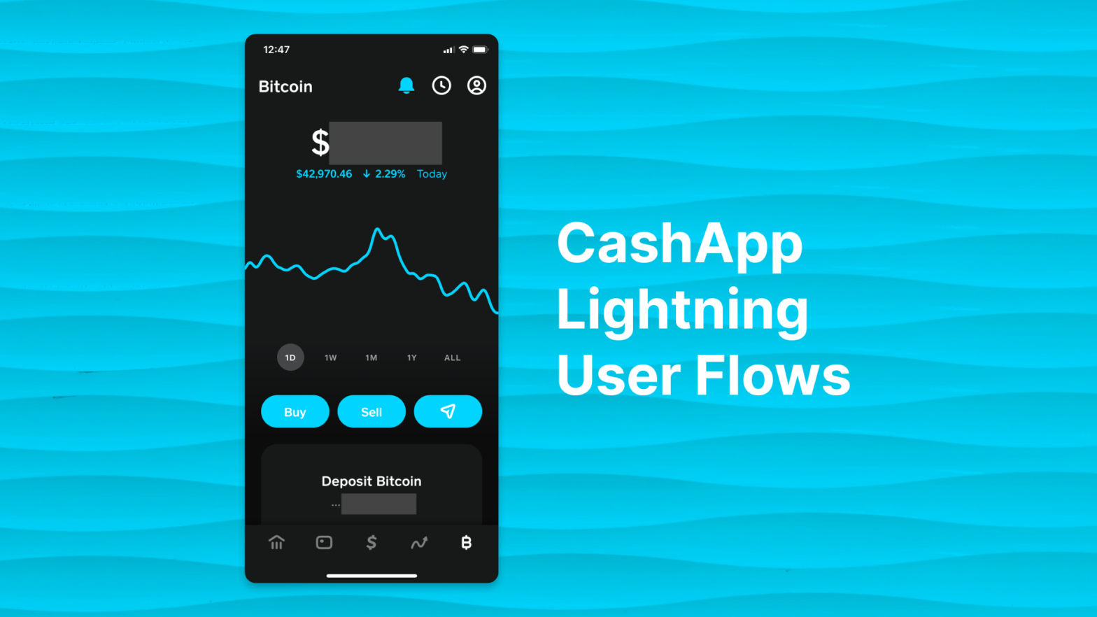
Like many others in the US, I recently got access to the Lightning update for CashApp. Here are some of my thoughts as I tested it out.
Onboarding
I open the app and switch to the bitcoin tab. When I press the “Send” button on the Bitcoin home screen, it shows me this message about Lightning. Nice, I think it outlines the value proposition of Lightning well.
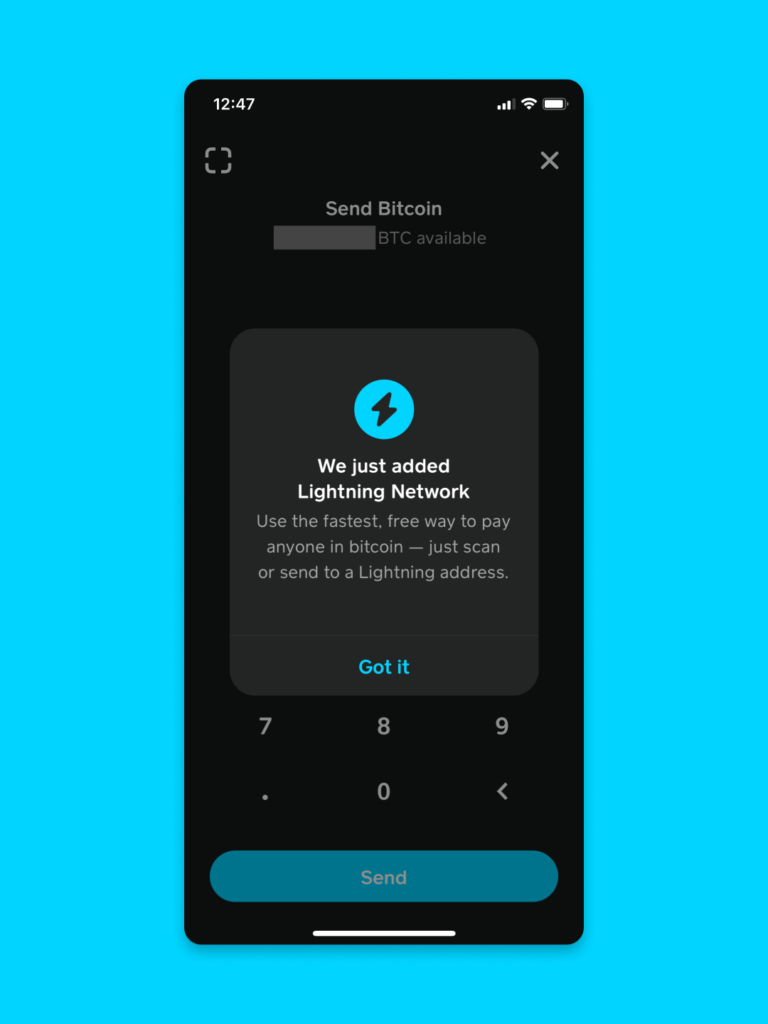
I found the inclusion of “Lightning address” confusing. Lightning payments do not use “addresses” like Bitcoin….they use “invoices”. “Lightning address” actually refers to a protocol that allows people to send to a Lightning wallet using an internet identifier that looks like an email.
Based on my tests, CashApp does not support Lightning Address. Therefore, saying “Lightning address” in the app could cause confusion in the industry. Read more about Lightning Address here.
Sending Flow
Send Attempt 1
I tap “Got it” and I am taken to the send screen. I type in $1 and hit “Send”. It tells me that there is a 0.00005 BTC minimum send. As a Lightning junkie, I am confused because $1 worth of sats seems like the perfect amount for Lightning.
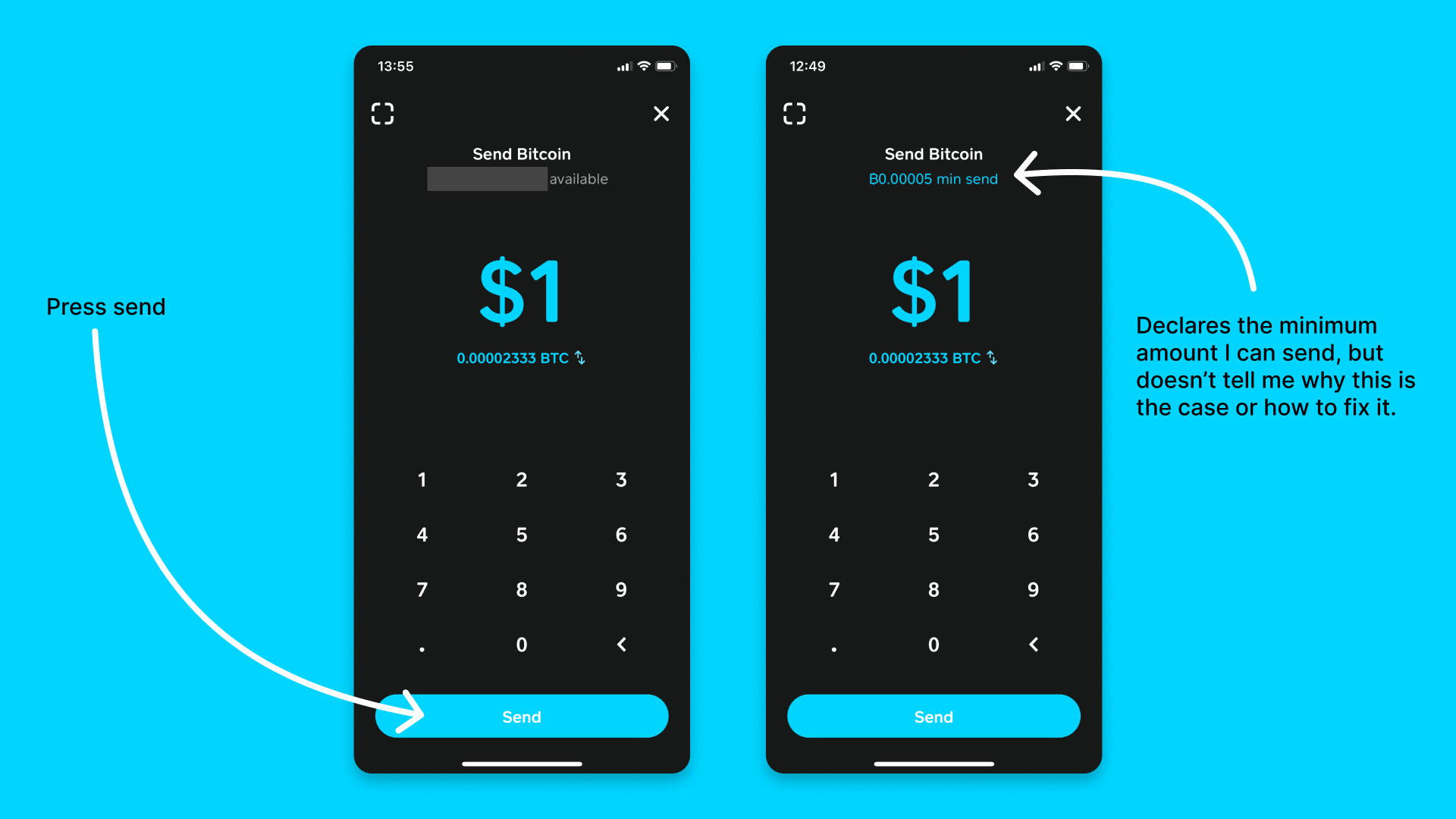
Imagining this from the perspective of a new user to the app, it doesn’t tell me why there is a minimum nor how I can fix this issue. My suggestion: this would be the perfect place to steer the user toward making a Lightning payment. Imagine that when the user presses send, it guides them towards scanning a Lightning invoice. If they try to scan an on-chain address, it tells them that the amount is too small and recommends they use a Lightning invoice.
Send Attempt 2
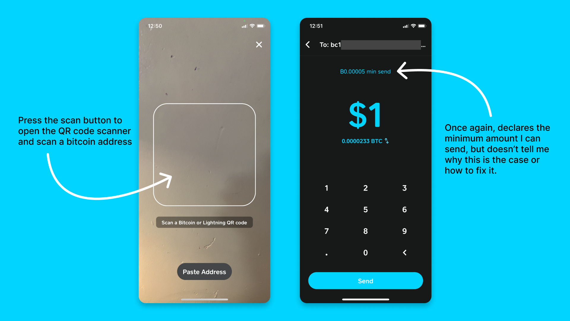
Moving forward: then I scan a bitcoin address QR code and type in $1. I receive the same minimum amount error. I will learn later that this minimum amount seems to be only for on-chain transactions with CashApp and not Lightning payments. Again: this would be the perfect place to guide the user towards using Lightning.
Send Attempt 3
Using another Lightning wallet, I create an invoice and scan it with CashApp. I am immediately asked for my PIN. Asking for a PIN prior to payment is a great security step. However, I was confused by this. Is CashApp about to make the payment without showing me any of the invoice details? Nervously, I enter the PIN and am presented with a loading screen.
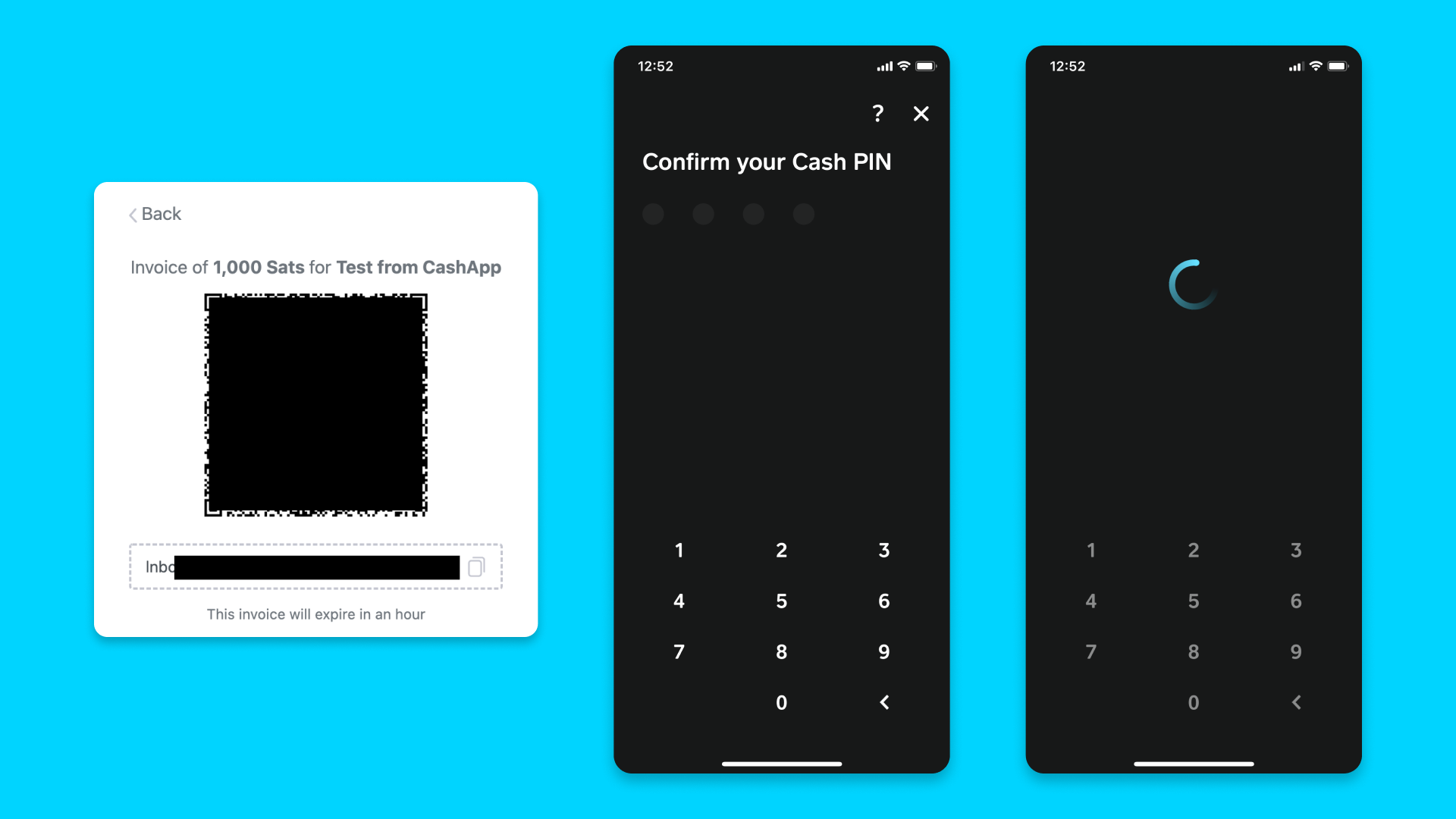
Consider that in a real-world scenario, the person sending from CashApp isn’t going to be the same as the person creating the invoice. Therefore, they would feel more comfortable if they felt like they had a chance to review what is being asked of them before submitting payment.
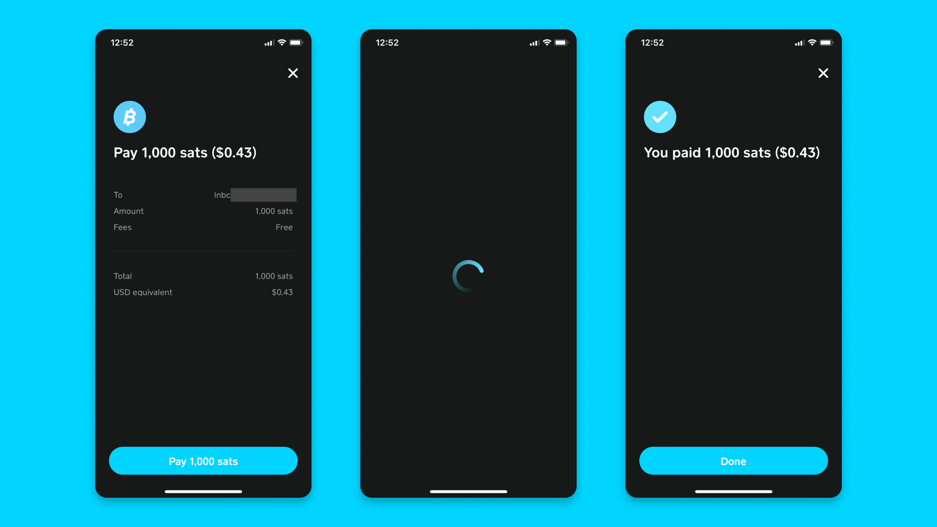
Fortunately, the payment is NOT being sent. I have a chance to review the invoice. Curiously, the description data (“Test from CashApp”) from the invoice does not display. Interesting. Anyways, I press the Pay button, and momentarily, I am informed that it worked. Yay!
Activity Flow
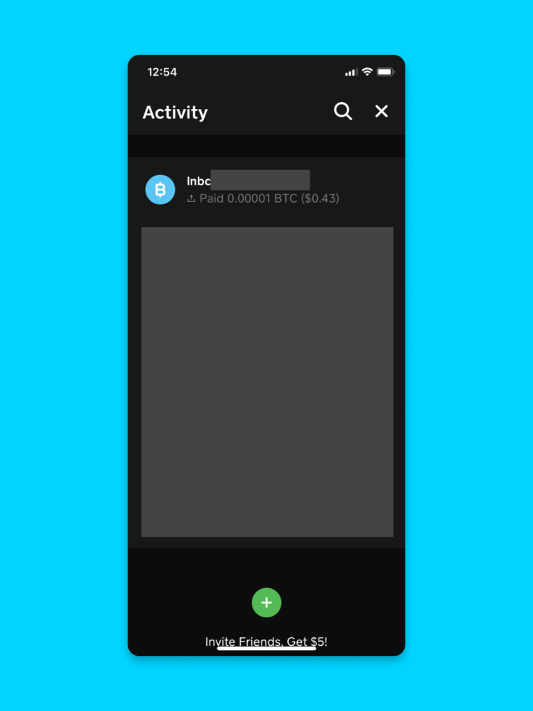
Next, I go to the transaction history screen. Curiously, while my other transaction history has convenient memos, the Lightning payment is simply a “lnbc1u…” string. This is indecipherable to a human.
I tap the payment to see more details. Curiously, it tells me mostly the same information. The only thing new here is the timestamp. Is there a way to add my own memo to this payment? I tap the “Completed” button to find out.
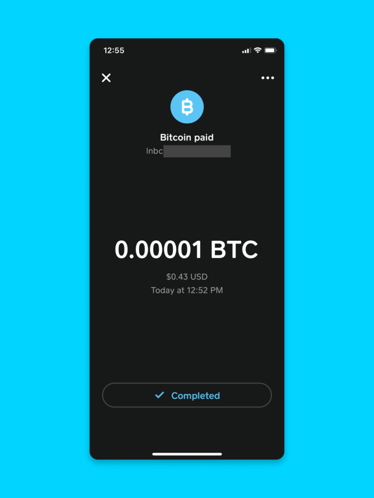
A modal pane slides in with the same payment details as before.
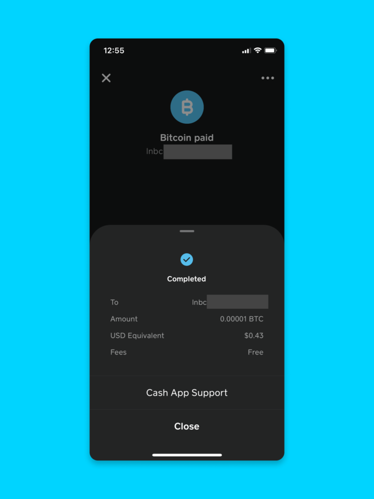
Effectively, these 3 screens show the same information. This feels redundant, and I haven’t found what I’m looking for: a way to re-label this payment with a description I understand.
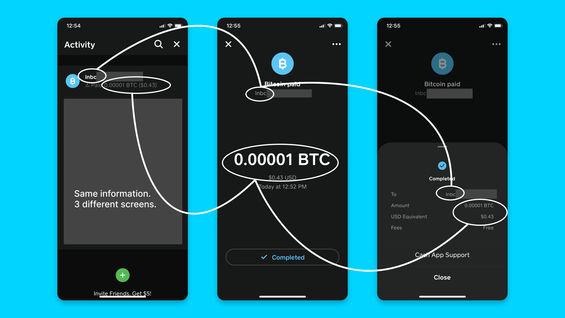
This could be an issue for a daily spending wallet. I’d suggest automatically pulling in the description field from the BOLT 11 invoice, and also giving the user the option to type in their own label should they choose.
For designers, here are some details and ideas about activity pages for bitcoin wallets.
Denominations
Another detail: the send flow denominates my Lightning payment in sats, while the activity flow denominates it in BTC.
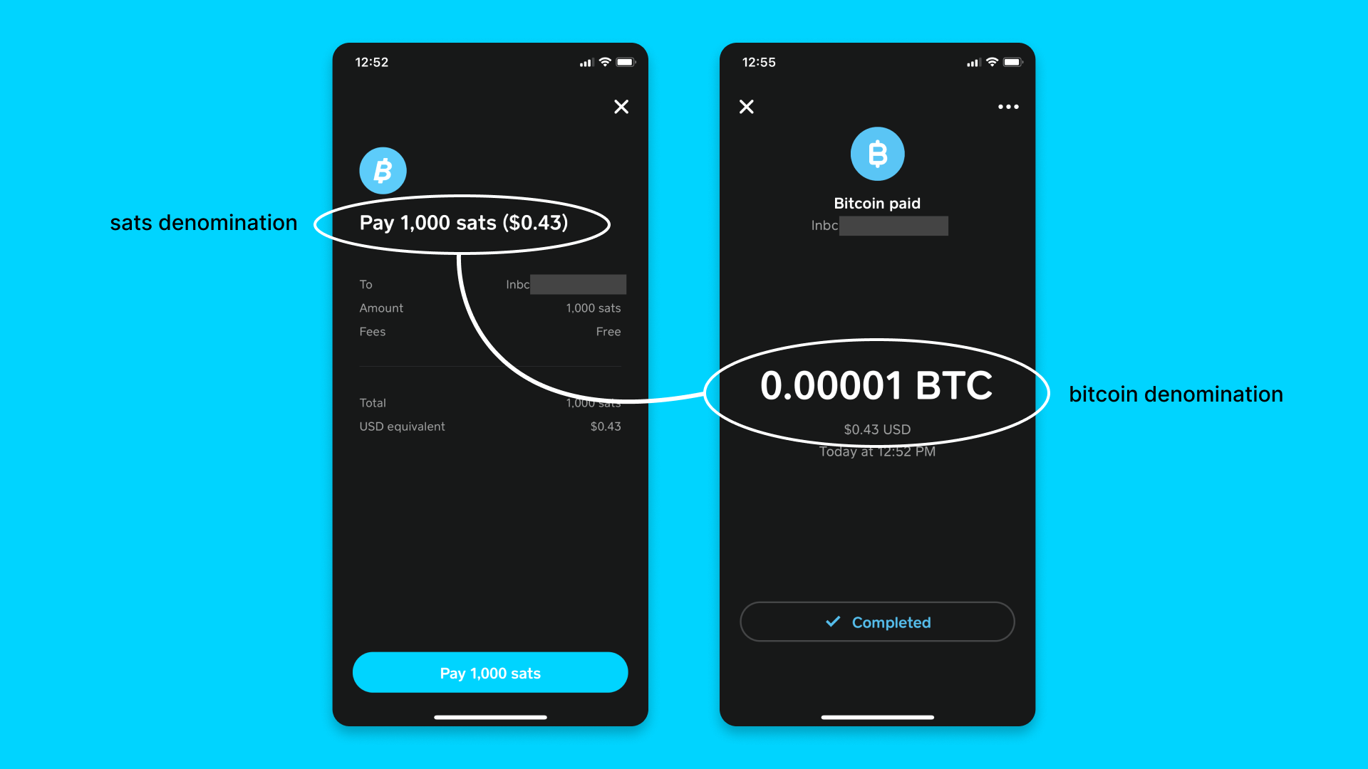
I understand how to make the conversion in my head perfectly fine, but I’m curious how other CashApp users might find this. Should the app use a consistent denomination throughout? Could this be defined by the user in their preferences?
Here’s some documentation on handling units and symbols within bitcoin wallets.
Conclusion
In summary, my suggestions are:
- Guide the user towards making a Lightning payment when they type in a small send amount
- Move confirm PIN to after reviewing invoice details
- Pull in the description from BOLT 11 invoice details
- Allow user to define their own memo
- Change “lightning address” to “lightning invoice” to avoid confusion with lightningaddress.com
- Consider if the app should use a consistent denomination of sats or bitcoin throughout the app (perhaps defined by a user preference)
Information for reference:
- Activity pages – Bitcoin Design Guide
- Units & Symbols – Bitcoin Design Guide
- Payment Request Descriptions – BOLT11
- Lightning Address
I’m super happy to see CashApp supporting Lightning and making use of LDK. Those of us at the Bitcoin Design Community would love to hear from you about the challenges you face when bringing this tech to your users.
